






Google has quietly refreshed its iconic “G” logo for the first time in nearly a decade, rolling out a sleek new gradient design to select platforms.
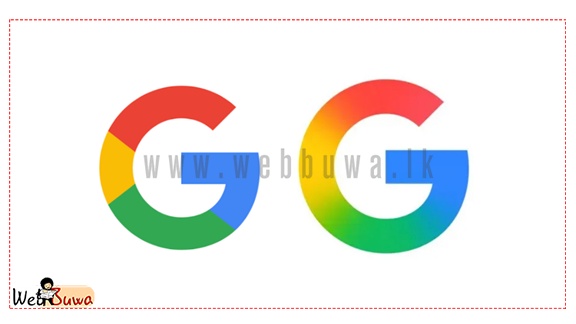
The update, spotted in the latest versions of the Google app on iOS and Pixel phones, introduces a smooth blend of the familiar red, yellow, green, and blue hues, replacing the previous version’s clearly segmented color blocks.
This marks the first significant tweak to the logo since 2015, when Google adopted a sans-serif typeface and unveiled the multicolored “G” that became a staple of its identity. While the latest update is more subtle, the gradient aligns with Google’s evolving visual style — notably resembling the modern look of the Gemini AI logo.
As of now, the updated “G” logo appears only on iOS and Pixel devices. It retains its older design on web platforms and other Android devices, suggesting a gradual rollout or selective design test in progress.
This minor yet meaningful shift highlights Google’s continued effort to modernize its branding across products and platforms.